There’s no shortage of content on the Internet. Every day, more than 2 million blog posts are published.
If you’re a content publisher or a company that does content marketing, all that content creates a challenge. How can you stand out? Is there any hope of getting your audience’s attention? Being memorable?
Some content publishers go with the volume approach for getting their audience’s attention. They publish lots of content – up to several pieces per day. Another approach is to create just a little bit of content, but make it super-duper high-quality content. Then you go out and promote it to the hilt.
Most of us fall somewhere in the middle. We create quality content on a fairly frequent basis, then promote it as much as possible. And that’s a perfectly good way to go about things.
Personally, I like to cheat.
I don’t mean stealing other people’s content. I don’t mean black hat SEO or clickbait or anything else. But I do mean leveraging how people’s brains work.
And people’s brains work with images.
Images grab attention
As you’ve probably heard before, our brains process visual information 60,000 times faster than text. But that’s just the beginning of how hard-wired we are to be drawn to images.

And while I’d love to rattle off a dozen statistics about why images are so very persuasive, that’s probably overkill. What we really need to know is how to apply all those statistics. How can we use all this nifty brain science to get more results from our marketing?
There are plenty of ways to do it. So many, actually, that we should just dive in now.
10 Ways to Use Images In Your Marketing
1. Always have a header image for your blog posts
There are several reasons to do this. First, when people land on the page, they’re more likely to stay if there’s an attractive image.
Second, the image you use becomes the default image people see after someone shares your post on social media. This gets you WAY more shares, and thus more views of your post. Want proof? OKDork and BuzzSumo studied 100 million articles. They discovered that articles with at least one image get more than double the shares than articles with no images.

Because that header image will be used on social media sites, make sure it looks good at different sizes. In other words, skip the small type.
To make header images for your blog, start with the online tool Canva. It’s the granddaddy of hundreds of the other online image creation tools.
And if you feel like you don’t have enough graphic design skills to fill a teaspoon, have no worries – check out Canva’s Design School for a quick-start design education.
2. Add an image about every 350 words
This is a recommendation from Neil Patel, based on a study by BlogPros about which articles get the most shares and reads.
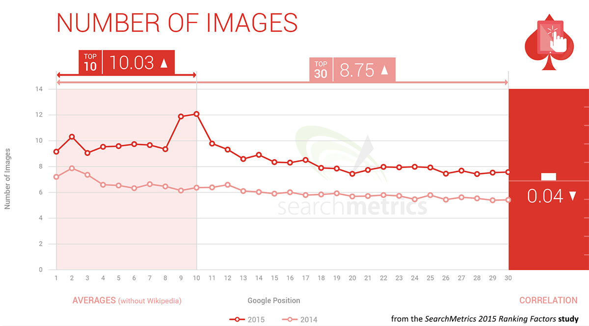
Having enough images is not just an issue of making things pretty. Images are so crucial to the user experience that they’re now a SEO ranking signal. That’s according to the SearchMetrics 2015 Ranking Factors study.
Don’t have any images to add? Oh, yes you do. There are dozens of free image sites online. My go-to Canva has a nice round-up of them. So does the nuSchool.
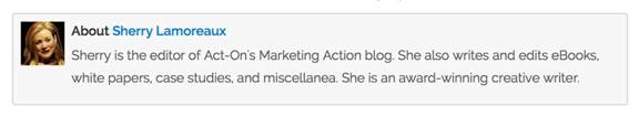
3. Include photos of your staff
People connect best with other people, not with faceless companies.
To make your marketing seem more human, include photographs of the people behind it. Add a photo of the blogger next to their byline. Include headshots of your staff on your About page. Maybe even add photos of everyone who contributed to an eBook near the credits.
It doesn’t have to be a huge image. Just something like this at the close of a blog post:
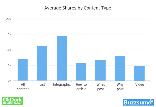
4. Make more infographics
Infographics may not be the sharing magnets they were a few years back, but they still do well. In fact, a study completed mid-last year by BuzzSumo found that infographics still get more shares than any other kind of content.
You don’t necessarily have to make infographics that go on forever, either. Three data points is enough for a simple infographic. Also be sure to use a file name that includes your company name, and don’t forget copyright information, a date, and the sources of the information you used in the infographic.
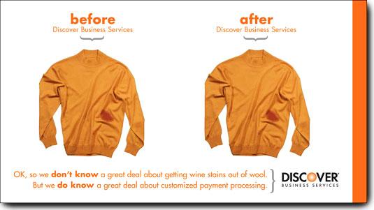
5. Use before-and-after images to show effectiveness
There’s a reason all those diet ads show images of people before and after their change. Nothing brings home the effectiveness of something better than a before-and-after shot.
This approach is so deeply ingrained in us that Discover Card didn’t even have to show a difference to make their point.
Here’s another example of this. What would be more compelling – to tell you Montauk and the Hamptons were crowded during Labor Day and then cleared out 24 hours later? Or to show you this:

Comparisons like that are what prompted the saying “a picture is worth a thousand words.”
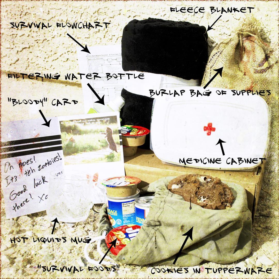
6. Use images for simple tutorials
You’ve probably seen step-by-step visual tutorials for how to tie a tie or apply makeup. These can be adapted for marketing purposes – even B2B marketing.
You can also just show what’s required for the “project”, like Cutting Edge Stencils did here:
![]()
Or you could also do a visual of a survival kit (for a huge conference, for the holiday marketing season… for day-long meetings?) or some other kind of package or kit. Here’s one for the zombie apocalypse:
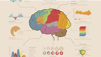
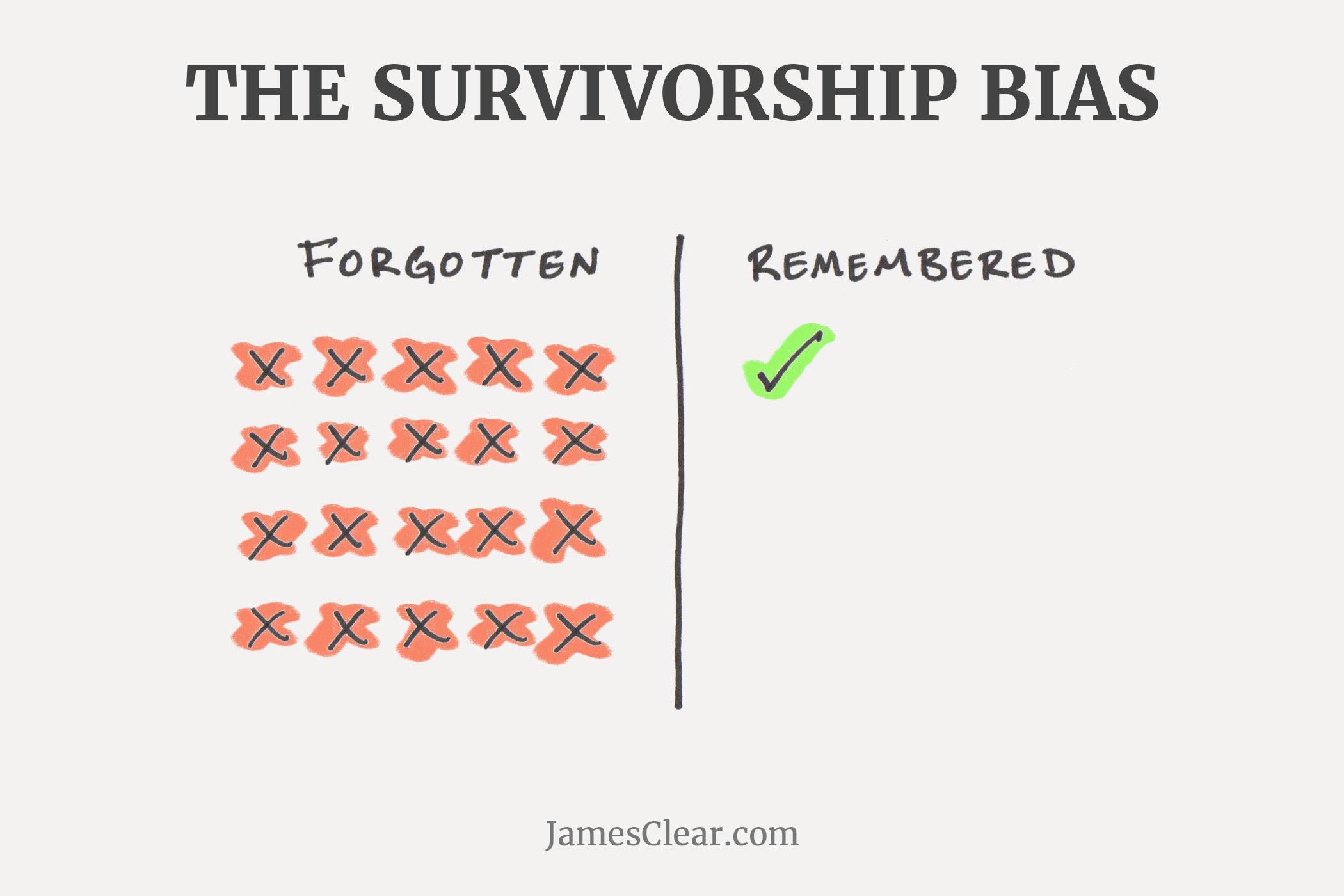
7. Use images to describe the anatomy of something
Also known as diagrams, these are good for top of the funnel, early education content. The image below was a section of an interactive infographic, the “Extreme Guide to the World,” created by the insurance company HCC Medical Insurance Service (HCCMIS).
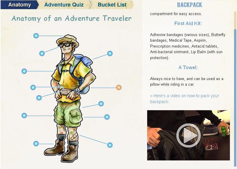
With some careful content planning, a brilliant execution of this interactive infographic, and some influencer promotion, the infographic generated:
- A 1000% increase in blog traffic
- A 96% increase in email revenue
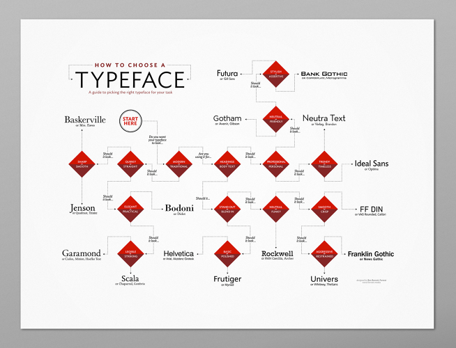
8. Use images to describe a process
Flow charts (aka “process charts”) get a lot of play in magazines. It’s time B2B marketers stole this technique.
There are a lot of “survival flowcharts” online to inspire you. It’s an easy twist to create a B2B version of this, like a “CRM upgrade survival chart” or a “Tax Season 2016 Survival Chart”.
Here’s a nice flowchart from FastCoDesign.com:
9. Use hard-drawn graphics, doodles or charts
Want to add a bit of edgy, start-up feel to your content? Hand drawn graphics are the ticket. You can also add some actual handwriting, too.
If even drawing a stick figure seems beyond your artistic capabilities, have no fear. Copyblogger has a terrific post titled How to Create Simple Drawings to Clarify Your Ideas and Captivate Your Audience that can get you started.
Once you’re comfortable with hand-drawn charts and stick figures, consider trying your hand with a business cartoon. Humor can be a powerful persuader. Just handle it carefully.
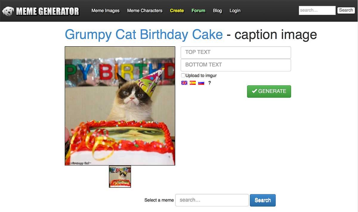
10. Make memes
These are the staples of many social media feeds. They’re basically just a memorable image that’s overlaid with a clever phrase or quote.
You can create memes with a dozen different free tools, like MemeGenerator.net. If you want to create these on your phone, check out WordSwag. It’s a fantastic tool for adding style to your social media accounts. It also lets you send some seriously stylin’ text messages.
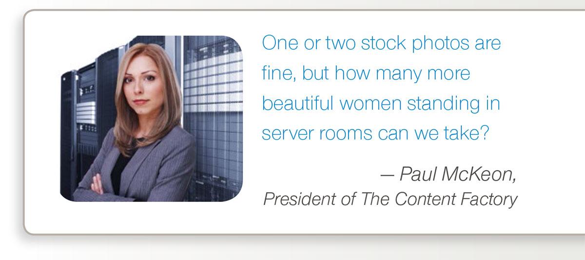
For better results, avoid stock photographs
This can be a challenge, but it’s more achievable than you’d think. But why do it at all? Because photographs of real people and places will get you more results than photos of models. That’s what a consumer credit counseling service discovered when they let MarketingExperiments run a photo test on their home page.
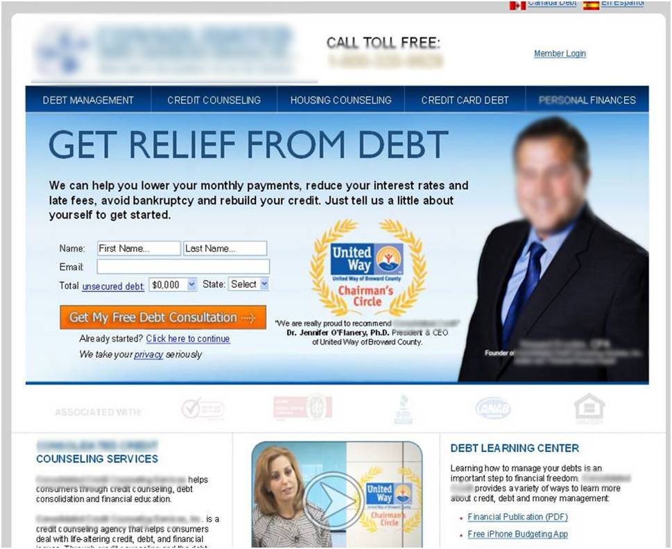
In that test, the image of a real person got 34.7% more conversions than the stock photo.
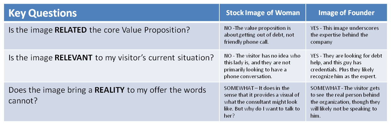
Based on the results of this test – and their experience optimizing websites for nearly two decades – Marketing Experiments put together this image assessment grid. It might help you ask the right questions when you’re selecting an image.
The Nielsen Norman Group also recommends using photographs of real people.
If you have to use a stock photo…
Just gotta use those stock photos? Then do us a favor: Check TinEye.com before you publish. It’s a free online tool that will show you how often your stock image has been used.
Here’s an example of an image from the very cool but also very popular free image site, UnSplash.com:

If I paste the URL of that image into TinEye, I get these results:
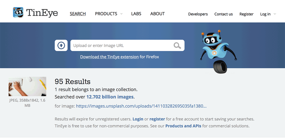
TinEye also has browser plugins for FireFox, Chrome, Opera and IE.
I’ve got one other piece of advice for stock photos: Pick stock photos that look less like stock photos. Every image database has thousands of perfectly polished models. But they often also have a couple dozen photos of people who look like real people. Run those real people shots through TinEye and see what you get. You might find the perfect shot.
Stay tuned…
We left something important out of this post. It’s one of the most applicable and most interesting visual elements. It bridges the gap between video and static images…
It’s animated gifs.
But we’re gonna make up for that real soon. Next week, actually. ‘Cause it’s time more marketers used moving pictures.
Over to you
 How are you using visual communication in your marketing efforts? Have you seen any instances where adding images actually hurt results? We’re open to everyone’s opinion – tell us what you think in the comments.