
In a recent webinar sponsored by Act-On, Thorin McGee, Editor in Chief of Target Marketing Magazine sat down with search engine marketing guru Kevin Lee to talk about how marketers can improve SEO for alternative types of content. That includes video, infographics, images, PDFs, and more. In this five-part blog series, you’ll get expert insights and best practices for developing the right types of content for your brand and making sure they get discovered by your target audiences. In part four, Kevin talks about how to create infographics and PDFs that can be found through search engines.
 KEVIN LEE: Let’s move on to infographics. There are a lot of best practices out there when it comes to creating infographics.
Not every visualization is a good visualization. Here is an example from Design Your Way showing an infographic that has gone wrong.
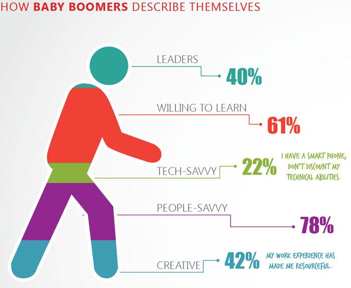
So at first glance, this doesn’t look too bad, but then you realize that because people could answer more than one thing, you end up with the numbers adding up to 243 percent. So it moves from being interesting to actually being confusing pretty quickly.
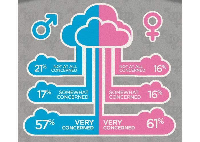
Here’s another example – it’s a situation where the iconography of the clouds doesn’t really line up with what it’s trying to portray. There’s sort of no direct correlation there, unless we’re comparing how concerned men and women are about clouds. So once again, this is just probably not a best practice in infographics.
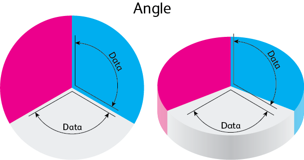
From the Visually blog, we have an example of chart-related issues. Using three-dimensional effects sometimes works and adds coolness to the overall look. Other times it actually ends up distorting what would otherwise be useful understanding about the relative proportions of something, because things tend to look different when you view them from an angle.
I’d like to thank my art director here at Didit for helping pull a lot of the bad examples he was able to find. There were many more, unfortunately.
So as far as good situations of infographics, it’s where you’re using color and graph and ways of making the information really clear. So infographics are really designed to be the picture-is-worth-a-thousand-words way of illustrating information.
According to infographics expert Stephen Few, you should focus all the attention on the data and how to make it most accessible and understandable to the viewer. Fine Line Infographics has a good roundup of best practices, including this one.
Here’s just another example from Visually… the bubble size tells you more than one thing at the same time. And it’s consistent because this is actually a graph about different balls used in the Olympics. And so they use the thing they’re talking about within an infographic schema, and it just all holds together.

This is an example of an infographic again that synopsizes information in such a way that you can learn about it really quickly. If it’s geographic-related information instead of an ordered list that ranked states or indicated information, if you can use a map to accomplish that, it certainly ends up being a good idea.
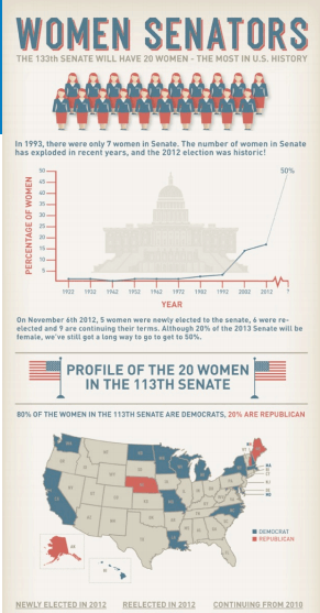
A group of great infographics can tell a story faster and easier than paragraphs of text. This one about women senators from NerdWallet, uses only two sentences before each stat is displayed. Overall you get a full picture of the entire subject.
 File Formats
In particular I think PDFs are underutilized by teams. A lot of times a PDF that’s created is held behind the firewall when it doesn’t need to be. In other words, the only way that anyone would ever get to it would be requesting a specific asset – say you have a lead form they have to fill out first, for example. And so, search engines like Google and Bing would never find that actual PDF unless it was sort of opened up out from behind the firewall.
 If you still want to figure out how to use the PDF of a white paper or eBook or whatever it is as a lead generation device, another way you could do that is to create two versions. The shorter one is more of an abstract and teases the viewers with a lot of the information that they would want, but doesn’t give them the full impact of it. And in that case you would not want write that in inverted pyramid style, because then you do actually give everything away in the first paragraph.
But you could create an abstracted version where it just alludes to a lot of the things you’ll learn in the full document, and then create a hotlink within the PDF to the lead gen form that you want to use to get that information from the potential customer. Sometimes Word documents can also rank highly for things, but PDFs tend to rank more frequently than Word documents.
There are a lot of best practices within SEO. Luckily a lot of them hold true regardless of the file type. But clearly there are some that are pretty video-specific. In particular the fact that up until now, Google can’t really tell what’s in most videos, although they have started experimenting with listening to your audio and actually transcribing it in order to understand what your video is about.
 Stay tuned for part five of this series, where you’ll hear Kevin’s answers to questions from the audience. Be sure to watch the webinar to get the whole story. And if you want more information on optimizing content for search, check out this eBook: How to Make Any Content SEO-Friendly.