
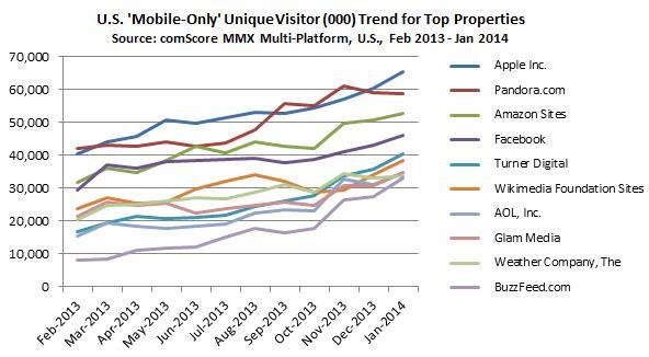
 By now, we all know that mobile searchers outnumber desktop searchers. It may have been true once that you could assume that a mobile user looking for your products or services would also be looking on the desktop, but a 2014 study from comScore indicates that there is a growing percentage of websites with a sizable cohort of “mobile-only users” – that is, the “portion of a publisher’s Total Digital Population that never visited their website via desktop.”
When comScore looked closely at the Amazon data, they found the young, tech savvy consumers you’d expect; they also found that Amazon’s mobile-only visitors included more than 25 million people between the ages of 35-64.
 What does this mean for you? Let’s connect the dots.
Mobile Search and Your Website
Ensuring your site shows up in search results is essential to your success; that’s obvious (or should be). As a means to drive traffic, conversions, and customers, search engines can provide immediate and long term value. Today, mobile is a direct avenue for additional traffic, conversions, and customers – and it’s underutilized by most companies.
Your website is accessed by a variety of different sources: bots come to your site crawling your pages (from Google, Bing, etc.), search engines send new visitors to your pages, visitors go directly to your site from bookmarks, others click links to lead to your site from social media, and many click on links in articles or on web pages to learn more. There are many ways for potential buyers to get to your site today, yet search is still one of the largest drivers of valuable traffic today. Not including mobile visitors and their needs in your search strategy development is like leaving money on the table.
Mobile Optimization Best Practices
Let’s take a look at some optimization strategies for mobile search. Keep in mind, in this discussion when we talk about mobile, we mean smartphones rather than tablets.
Mobile Indexation
Notifying search engines that you have mobile-formatted pages is one of the first rules of mobile configuring for SEO. Like traditional desktop SEO, ensuring search engines can find and index your pages and content is imperative for success. Websites can signal your mobile configuration to search engines to make sure they understand your mobile setup.
Three Mobile Configurations
- Responsive Web Design. The server always sends the same HTML code to all devices and CSS is used to alter the rendering of the page depending on the receiving device. Said another way: Responsive design serves all devices with the same code that automatically adjusts for screen size. This is the most effective, responsible configuration.
- Dynamic Serving. Depending on the user agent requesting the page, the server responds with different HTML (and CSS) on the same URL. Mobile content is “hidden” when crawled using a desktop agent with this setup. This is not an ideal configuration.
- Separate URLs. Each desktop URL has an equivalent, different, URL serving mobile-optimized content. The result: desktop users are presented with one URL, mobile users another. This is also not ideal. Your SEO value is diluted, as some people will link to one URL, some to the other URL. Neither URL will reflect the page’s true traffic. You can reduce this risk by using a rel=canonical link (typically going from the mobile site to your desktop site), which will let Google know to attribute the traffic to the canonical page.
Differing best practices exist based on your specific mobile configuration setup. This first step in optimization, however, is ensuring indexation happens appropriately. Make sure you understand the programmatic differences in each type of mobile setup by understanding your mobile website configuration.
Mobile SEO Best Practices
- Page Load Speed: Just as with desktop SEO, page load speed is key to success. Usability and the quality of the visitor experience can be dramatically impacted by page load speed. More than just optimizing images, mobile page load speed optimization involves leveraging proper browser caching, reducing redirects, and minifying code. Ensure you are taking page load speed into consideration with mobile SEO. Consider the Opera Mobile Classic Emulator to test elements on your site.
- Indexation Blocking: Not too long ago, mobile devices couldn’t handle all available code when browsing the web. However, today’s more advanced mobile devices can. Sites that currently block elements of CSS, JavaScript, or images should reevaluate their blocking. Hiding content is never a good thing in SEO, especially with mobile.
- User Experience: Considering the user’s experience on mobile devices is an obvious, yet often over looked aspect of SEO for mobile. “Above the fold” is completely redefined from desktop elements, in that the space becomes much more compact and limited. Elements such as Flash and pop-ups are not optimal for mobile devices either. Developers are limited in the advanced technologies they can use to improve mobile user experience, so what is there to do?Implementing advanced elements of animation can be difficult but certainly it’s possible. Yelp, for one, has done a great job of implementing animation within their mobile environment, so it’s not out of bounds for advanced development teams. But remember this above all: The mobile design that delivers a great user experience is most often simple and clean.
- Titles and Meta Descriptions: Limited screen space throws extra attention on the length of meta titles and descriptions in search results pages (SERPs). Best practice length for titles on mobile is 40-60 characters and meta descriptions within 90 characters and spaces. Additionally, a search result without a rich snippet and one with a rich snippet look completely different and perform drastically differently in mobile vs. desktop devices. It’s important to review meta titles and descriptions and how they appear in SERPs. Implementing Schema.org structured data to take advantage of the proportionally large space rich snippets allow (Schema implementation) is recommended.
- Using Apps: Creating a fully functional app is one option for mobile optimization. Users would be required to download a specific app to browse a site’s web environment. This allows you to tailor the mobile experience for your visitors; however, it’s a large expense. Building an app can be quite similar to building an entirely new website, with its own individual optimization needs. More important: Do your customers want, need, or expect an app from you? Don’t jump on this bandwagon without a compelling business reason to do so. If you go this way, know that app optimization has its own subset of SEO considerations. If this is a concern for you, we recommend this article on app store optimization from Kissmetrics.
Mobile SEO Mistakes to Avoid
- Videos and Embedded Images: Visual content that isn’t optimized for mobile devices is a mortal sin in online marketing today. You’ve spent such a long time developing great content; don’t lose momentum by neglecting your mobile audience. By ensuring non-Flash elements render on your pages, HTML5 usage is consistent, and that video optimized for specific browsers and text/menu/images/video are checked for executed display, you’ll be well on your way to avoiding mobile mistakes.
- Sitemaps: If you are using two URLs, creating a mobile sitemap is an essential part of having proper indexation on your pages for mobile search. Submit an XML sitemap to Bing Webmaster Tools and Google Webmaster Tools, paying careful attention to keep mobile pages separate from desktop. Crawl errors are available to show you where Google and Bing find errors within your sitemap. Whenever you have an opportunity to improve crawling and indexation, take it.
- Local Search: Most local searches happen via mobile devices. Time and time again surveys show users are using mobile devices for locally intended searches (with very high conversion rates). Make sure your site is submitted to Google My Business and keep your physical address, hours of operation, and contact information very clear and consistent on your site. Names, addresses and phone numbers are the most important key elements to keep consistent for your local presence in search.
- Redirects: Ensuring your site has limited redirects is essential to SEO on mobile. When individuals are trying to access your site you want to serve them the correct versions. We recommend you use server-side redirects (301s or 302s) instead of JavaScript redirects. Use a tool like Screaming Frog to understand redirect chains so you can limit them; this will support both desktop and mobile SEO.
Keep in mind that the mobile SEO landscape is continually evolving. What works today may be different tomorrow. The only constant is change, and we’ll try to keep you updated when the next big shift happens.
 Now that you know the tips and tricks for making sure your company is being found on mobile devices, it’s time to take it one step further and make sure those search results turn into leads. Take a look at this eBook, How to Use Mobile Marketing to Generate Leads, to understand the complexities of mobile marketing in the B2B market, and get nine action steps you can take to generate leads with mobile.
Have mobile search engine optimization tips of your own to add? Add to the discussion in the comments.