
 Are your landing pages converting as well as you’d like them to? If the answer is no, maybe it’s time to go back to the basics. Let’s examine the building blocks of a good landing page and take a look at five best practices for creating landing pages that get great results.
Before we get started, we should first define what a landing page is and why you need it. Simply put, it’s a web page you’ve designed, usually to make an offer to a visitor who comes to your site by clicking a link from an online source. It might be a link in a tweet, a blog post, an email, a pay-per-click ad, another site, or a page on your own site (and so on).
Most of us use landing pages as conversion tools, and they’re among the most potent ones we have. The copy around the link makes a promise (such as “Learn how to…”), and the landing page pays that off by offering something of value (an eBook, video, podcast, or any kind of content your ideal buyer will appreciate). Your visitor has to want the content enough to trade their contact information for it. They get valuable information in return – and the better it is, the more it fulfills the promise, the better you look to that potential buyer. You get at least the name and email of someone who’s motivated to investigate your product, service, or industry. That’s a nice start to a reciprocal relationship.
Like everything else in marketing, landing pages are a blend of art and science. The investment you make in time and talent means that you need these pages to pay you back with leads that convert, and useful information. Let’s look first at making a landing page, and in the next part of this series we’ll look at how optimizing copy and making the right offer can improve results.
The anatomy of a landing page
Landing pages consist of common elements. These include the offer, copy, the form, and the design of the page itself. When creating landing pages, think of these elements as your building blocks.
1. Create a compelling offer
The offer is the most important part of your page. It’s what you offer to prospects in exchange for them sharing information about who they are and what they’re interested in. The better the offer, the higher the conversion rate. The offer should also be closely tied to your brand’s value proposition, in order to attract the people most likely to want what your company sells. If you sell industrial solvents by the carload, your offer might be related to health and safety management concerns that your company takes care of, for example. Test your offers. One eBook might convert much better than another, and a video might outperform them both.
2. Fine-tune the copy
Your headline should be simple and specific. It should offer a benefit, not a feature, and ideally be so strong that the motivated reader will jump to the form right then and there. Your body copy should describe the offer and the benefits that it will deliver to your prospects. Keep your copy simple and specific, make your sentences short and active, and support the headline and call to action. Test your headlines, at the least. Ideally, you should test every element of your page.
3. Develop your landing page form
The landing page form will have fields that allow you to collect information about your prospects. You should ask for a name and email address at a minimum. What else you ask for depends on all kinds of factors, including your industry, what you sell, how long your sales cycle is, and usual size of a deal, as well as the value of the content you offer.
 You’ll usually get more conversions from a shorter form. Longer forms can put people off; you don’t want to ask for too much, too-personal information, in what feels like too-short a time frame to the prospect. If you need more information, you can use a series of progressive profiling forms to get it, which is slower but seems friendlier. Of course, if someone is willing to fill out a long form, they may be a better-qualified prospect, or have a more urgent problem to solve.
Note: If people often give you false names and email addresses, then don’t provide the reward (the download, or whatever) on a thank-you page that follows the form. Instead, let them know that you are sending them an email with a link to the download. This allows you to verify that their email is real before you add it to a list, and also allows you to send that email immediately, demonstrating how responsive you are.
4. Create a strong call to action
Make it easy for people to know what to do next. Your call to action, whether it is text, a button, or an image, should clearly indicate the action and the reward. This is another thing that’s important to test, so you’ll know whether “Download now” or “Get the eBook” is going to deliver more conversions.
5. Design with conversion in mind
With an offer, copy, and form specified, you can design your page. It’s important to design the page so that the visitor’s attention is centered on the form. Don’t let your page get cluttered with too many images or too much text. Use lots of white space and bullets so that the page is easy to read. Make sure it looks like your brand, and that the page looks like it belongs on your website (and only your website). Use your standard colors, and use the same fonts as you use on the rest of your website pages, in the same sizes, with the same spacing.
6. Optimize the design for mobile
 Make sure your landing page looks good on mobile devices. In fact, if you aren’t yet using responsive design, you might want to design with mobile in mind. Use bigger text and make sure the buttons are large enough to tap with a finger. Plus, there’s no “above the fold” anymore – or at least, different size screens make it difficult to know where the fold might be. That’s why you may want to create a smaller version of the CTA right at the beginning – one that jumps to the web form.
Landing Page Case Study
Now let’s take a look at a real-word landing page makeover — in this case, an Act-On survey landing page with a chance to win a MacBook Pro.
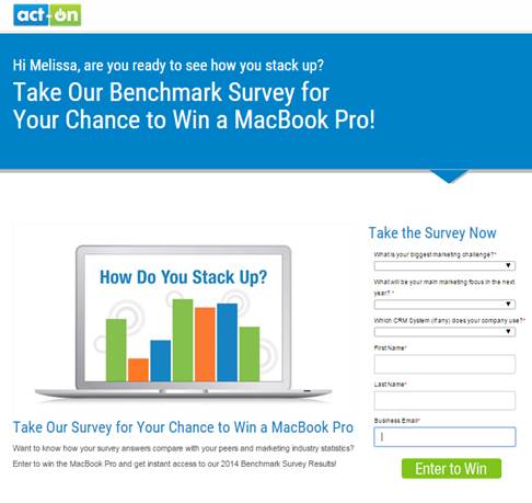
This survey landing page demonstrates five best practices for forms – and resulted in significant improvement in our conversion rates. We tested these different elements to optimize our landing page. Keep them in mind when you are designing your landing pages.
Form fields: Test different types of forms. We tested using a drop-down list instead of check boxes. This made the form much smaller and less overwhelming to the viewer. The drop-down list was also much easier to submit on a mobile device.
Pre-filled information: If you have any information on the submitter, pre-fill it in for them to minimize the amount of information they have to input themselves. This saves them time (always appreciated) and also subtly reminds them that you already have a relationship. Include only the fields required by your sales team or CRM.
Responsive landing page: Having a responsive landing page makes it much easier for mobile viewers to read your landing page and submit forms. If you don’t have a responsive landing page, design with mobile in mind. Make sure you understand what the page is going to look like when viewed on a mobile device.
Call to action button: Test various calls to action. Doesn’t “Enter to Win” sound more fun than “Submit?”
Design elements: Try adding animation or some interactive element to your landing page to catch the viewer’s attention. We added an animated GIF to the landing page to add movement and reinforce the copy. Just make sure it doesn’t distract from the form but rather supports the call to action.
 A well designed and though out landing page should incorporate some key practices for crating pages that convert visitors to your site into valuable leads. Do you want more landing page conversions? If the answer is yes, then take a look at our eBook – Building Better Landing Pages, and learn the six best practices for creating landing pages that get great results.