
When it comes to online marketing, the rhythm that the experts are beating their drums to is high–quality–content. Countless blog posts, white 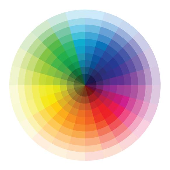 papers, and infographics have been dedicated to the umpteen Google updates that reward quality content and push low-quality, poorly written, spun content to the bottom of the pile. There is so much focus on the SEO game of attracting leads that sometimes, other important factors (that just might make or break your conversion rates) don’t get as much attention.
Design Matters
No matter how well-written your online marketing pieces are, if they cannot catch the attention of the reader, they will not be effective. Plenty of studies have been rounded up that point to the fact that online readers like to skim for keywords and jump around the page rather than reading from left to right, top to bottom. If you want to boost conversion rates, you have to understand these tendencies, then use them to direct the reader’s eye along the path to conversion.
Color and Conversion: Is There a Connection?
A 2006 study observed the relationship between how people felt about brands and the colors that were used for marketing materials. Researchers found that marketers were able to successfully influence appetites, moods, patience, and anxiety by choosing the right color for the job. It’s clear that colors can affect the way that people feel, but can you use color to influence how they act?
Testing reveals that one of the most important conversion factors may, indeed, be color.
Color vs. Color: The Case Studies
When it comes to marketing, the proof is in the pudding. Here’s a look at a few recent case studies to see how color affected conversion rates in these situations.
- Red vs. Green. When the makers of the health app CareLogger wanted to
 boost conversions, they took a step-by-step approach to redesigning their landing page. In order to measure the results of each change separately, they tested a new headline, button color, and button text individually. The overall effect was a 72% increase in conversions, 34% of which was attributed to simply changing the button color from green to red.
 - Blue vs. Yellow. Online marketing guru Neil Patel pulled together a lot of research about how colors affect our emotions and how color can contribute to brand recognition and increased spending. While discussing these studies, Patel ran a test to see if he could improve his own conversions by changing his button color from blue to yellow. The result? A 38% increase in conversion rates.
- Accentuate the Positive. This study of a set of buttons for a scheduling company looks at how people lean towards options that appear to be the most different. On the original landing page, three options were presented: free, expensive, and middle of the road. The goal was to drive more people to the middle of the road choice. By first making all three choices visually similar, and then changing only the color of the middle button, they were able to raise conversions on that choice by 95%. (!!)
The Importance of A/B Testing
It’s clear that color is a major player when it comes to conversions. You could look to the research says about red making people hungry and blue making people feel strong, but that won’t get the results you want if that’s not what your customers are actually feeling in the context of your marketing asset. The trick, then, is to figure out what colors your customers want to see – and A/B testing is your ticket to success.
A/B testing, sometimes called “split testing” presents two versions of a page to see which performs better. In order to get the best results from an A/B test – especially when testing for color – it is essential to make the two pages identical except for the one thing you are trying to test. Otherwise, you won’t know which increases or decreases in conversion are truly attributable to color changes, or if they’re attributable to some other change you made.
Keep in mind that A/B testing can often point out that our gut instincts about color are wrong. Looking back at the green/red color test from the first case study, the initial assumption was that green would perform better. The marketer’s assumption was that people typically associate green with “go,” and that red would be associated with “stop.” Imagine their surprise when the results pointed so clearly to red being the winner.
Check out our video, >The ABCs of A/B Testing, to get the skinny on A/B Testing.
Trust the Numbers
The key to increasing conversions online is to test, test, test – and then believe the results. In all the case studies presented, marketers had presumptions about what would work better and were sometimes surprised by the results.
In some cases, you might find that a color or design that you personally find more visually appealing is performing poorly when compared to one that you find less attractive. Resist the urge to rely on your judgment and trust the numbers. Often the winning combination performs well because it is less attractive and, therefore, commands attention. Remember that performance is always a marketer’s top priority, even if you aren’t fond of the  look of the pages that work.
If you’re looking for more tips on optimizing performance, check out our eBook: The New Marketing Metrics for B2B.