B2B marketers are creating an increasing number of infographics, and it’s not because of anything in the water. Sixty-five percent of people are visual learners. This single statistic alone might explain why quality graphics are shared at triple the rate of other types of content — and it might explain why marketers are creating more infographics than ever.
But even if you’re creating this type of content, it’s possible that you’re not getting the maximum results for your efforts. According to Neil Patel, a consistent method, unique story, and reliable statistical data are critical to the success of your infographics.
But what other factors transform an average infographic to one that yields excellent performance? Here are seven easy tips for boosting the performance of your next infographic.
1. Start with the right topic
Marketers often make the mistake of selecting topics that are far too general. Instead, start with the main pain points of your target audience, and then get really specific with the content of your infographic.
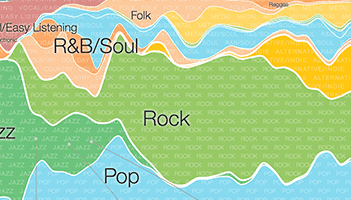
For example, one strategy is to create a time-bound graphic that shows the evolution of something that’s important to your customers.
For example, Google created a timeline of music trends from 1950 to today. They’ve also created a microsite for this content that allows them to optimize for SEO and makes the infographic simple to share.
Another example is the Content Marketing Institute’s infographic, “A Brief History of Content Marketing,” which traces this type of marketing from circa 4200 B.C. (“Six Ways This Spear Can Save You From a Wild Boar.”)
After providing rich, graphic intensive information, the infographic includes a call to action with promotional information about an upcoming event.
A UK-based car loan company takes a different approach, and shows how road technology is changing through their infographic titled “The Road of the Future.”
A timeline is just one style of infographic. Others that work well include:
- A comparison between two popular options
- Big trends that matter to your target audience (check out Google Trends for ideas)
- Maps that show best practices and processes
The key is to test different styles and formats to determine what works best for your target audience. They may prefer one format over another or one tone of voice or one visual style. This will become clear as you create and measure the performance of different types, formats, and styles of infographics. You’ll know when you look at your engagement numbers.
2. Promote with greater success
Most marketers know they need to promote their infographics, but how much is enough when it comes to this task?
First, share your infographic over all of the social channels in which your target audience participates. For B2B marketers, this is likely to be LinkedIn and Twitter.
Second, regardless of channel, ensure you’re engaging in more than one round of sharing.
You can make each share fresh by selecting several different data points from your infographic. During each new round of sharing, highlight a different point. You’ll find different audiences respond to different talking points. Also, don’t be afraid to ask for help with sharing. Ask colleagues, audiences, and others to share your content; make it easy to do through social plug-ins. Pick an image or icon to visually carry your message.
3. Partner with influencers for greater impact
Connect and nurture relationships with influencers in order to expand your reach. Start by identifying the trendsetters for your target audience. These are the people your target audience follows, listens to, and engages with regularly. Once you have identified them, connect with these individuals, share their content and start building a relationship.
Request interviews for blog posts and other types of content, then pull some of those quotes into your infographics to bring them to life. Plus, when you add influencer quotes, influencers will be more compelled to share your infographics with their audiences (double win!).
Remember, these people need good, fresh content to share with their own audiences, so they’re looking for interesting things to share.
4. Keep it simple
One of the best things about great infographics is their simplicity. Good ones distill complex ideas into a much simpler form. So avoid the temptation to be needlessly complex, and stick to your topic closely.
For example, PC Magazine published the infographic, “The Current State of Backup.” The infographic is simple, highlighting the best (and worst) practices of Mac users and addressing the worries of their target audiences.
Another example of keeping it simple is this surprising infographic published by No Nonsense Insurance:
This infographic is centered on a single theme – the specific effects of music on driving – which makes it easy (and consistently interesting) for the target audience to follow.
5. Create something unexpected
Take a look at all of the infographics created by competitors about topics that interest your target market – and then do the complete opposite. For example, Massive Health and Column Five created the infographic, “Why Eating Fat Doesn’t Make You Fat”:
The infographic lets fat off the hook by explaining specific steps involved in weight gain, and by dispelling common myths.
6. Use quotes as social proof
As we mentioned above, quotes are great resources for infusing your infographic with personality. Plus, they’re great social proof (especially if they’re from the influencers).
Quotes also make your content more entertaining and boost shareability. For example, this infographic from the Glow agency in Liverpool is targeted at design professionals, with a goal to entertain and inspire them in their work. The very first quote here is “The client may be king, but he’s not the art director.” — Von R. Glitschka. Doesn’t that make you want to read and share the rest?
7. Don’t forget a call to action
It’s surprising how many great infographics are missing a call to action. When selecting your topic, don’t forget to define the purpose of the infographic. Ask yourself these questions:
- After people read the infographic, what do you want them to do?
- What might they appreciate next?
- How will you know that the infographic performed well?
For example, maybe your audience would follow you on Twitter if you asked them, or download a gated eBook on the same topic offering more information (generating leads with clear interests). You can avoid missing great (and obvious) opportunities by never forgetting a call to action when producing infographics.
For example, Venngage created an infographic that plays on the recent release of another “Star Wars” movie to leverage key design principles. (On a side note, these design elements are great to consider when producing an infographic, so take a look):
Unlike too many infographics, this one remembers to include a call to action. It’s very clear, very simple, and very direct.
Test and Learn
Infographics and other visual content will continue to be increasingly popular. New trends, such as interactive infographics and quizzes, may also become popular as marketers experiment with the power of direct engagement with their audiences through interactive content.
As with all marketing efforts, it’s important to continue to test and modify your approach based on the results. Test so you can identify what resonates best with your target audience, so you can leverage that information to better serve its needs. Keep testing, as trends change, our audiences change, and your own key messages change.
Does your company use infographics? If so, what have you found to be most successful in creating these pieces of content? What’s the most successful infographic you’ve made?